- 04 March 2025
Is Your Website Actually Helping You Grow?
First impressions aren’t just fast — they’re final...
8 Signs Your Website Needs a Redesign
01Your Design Still Thinks It’s 2010
Still using a homepage slider? Tiny fonts?...
02It’s Not Mobile-Friendly — and That’s a Dealbreaker
With over 60% of global traffic now coming from mobile...
03Your Load Speed Is Slower Than Dial-Up
53% of mobile users will leave a site if it doesn’t load in 3 seconds...
04Your Brand Has Grown — But Your Website Hasn’t
You’ve evolved. New markets, new offers...
05It’s Not Getting Results — Or You Can’t Track Them
Is your site generating leads?...
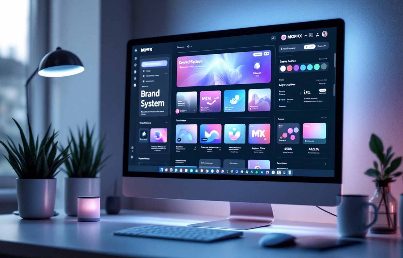
06Your Tech Stack Is Holding You Hostage
If your marketing team can’t update the homepage...
07You’re Invisible on Google
No matter how beautiful your site is...
08You’re Embarrassed to Share It
Be honest: do you avoid sharing your site on LinkedIn?
The ROI of Redesign: More Than Just a Makeover
A website redesign isn’t just about aesthetics...
Studies show that redesigns focused on performance...
Big Redesigns, Bigger Results
01IBM – The Power of Design Systems
IBM transformed its enterprise presence... ibm.com/design
02Dropbox – From Storage to Smart Collaboration
Dropbox rebranded and rebuilt... dropbox.com
03Gymshark – UX That Moves Product
Gymshark’s shift to Salesforce Commerce Cloud... gymshark.com
04Noon – E-commerce at MENA Speed
Noon’s redesign optimized for regional UX... noon.com
05Reddit – When UI Meets Community
Reddit redesigned to feel more app-like... Wired feature
Redesign or Rebuild? How to Know
Redesign = new look, same bones. Rebuild = full rethink...
Why Most Redesigns Fail
Redesigns flop when they’re led by aesthetics, not goals...
Still Not Sure?
Ask yourself:
-
Are users converting — or just browsing?
-
Can your team update content without code?
-
Does your brand feel premium online?
-
Is your site slow, clunky, or hard to navigate?
-
Would you proudly send a prospect to your homepage right now?